Working with pre-landers in Affiliate Marketing
A pre-lander is a page or a website a user sees after clicking on an ad and prior to going to a landing page. A lander is there to show and sell a product, while the pre-landing page softly mentions the product, telling how it helped to solve some problem.
You can use a pre-lander for different purposes:
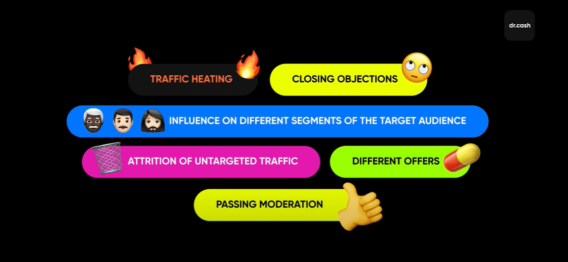
- First, to warm up traffic. In other words, you provide extra information to generate more interest in a product and persuade a user that they really need it.
- Also, a pre-landing page helps to overcome common sales objections.
- It can help to increase conversion, reaching out to different target audiences, you show a transit page to different user groups depending on their age, interests, mindset etc.
- The next point is eliminating untargeted traffic, in other words, a pre-landing page helps to filter out those who got interested accidentally and the non targeted audience. This helps to increase the KPI for your advertiser.
- Also, a pre-landing page can lead to landing pages with different offers and showcases. Thus, if a user refuses to buy a certain product, he or she may get interested in another one.
- A pre-lander can help your ad campaign to pass moderation on major traffic exchanges, such as, for example, Facebook. If you work with grey offers or the offers that are grey to some extent, the moderators won’t approve a lander, but a well-done pre-lander can pass moderation.
However, there are some nuances of using pre-lander:
- First, a client gets a step further away from the product – you may lose the traffic that isn’t warm enough.
- Secondly, it’s not free. You have to pay for page creation and hosting, you may need a copywriter, a translator, etc. It’s worth noting that sometimes you won’t have to pay the full price: if you work with dr.cash, you can get a pre-landing page for free, thus, you will have to pay only for hosting.
- The third aspect is that a low-quality pre-lander fears users away, especially if an offer is expensive. We think everyone has seen such a pre-landing page at least once: it doesn’t only look suspicious, but also makes you feel like they doubt your intelligence. By the way, we always have several pre-landing pages for popular offers. Also, you contact a personal manager and find out which funnels are the most effective. Learn more about working with pre-landers in our video.
How to create a good pre-lander
The first thing is that you can download them from the affiliate networks’ website – see the product description section. They may be initially provided by advertisers. The problem is that they are available for everyone, used actively and aren’t new for users. In this case, you can use at least 3 methods to create a pre-landing page:
- Copy an existing one. Pre-landers that are publicly available may have already been worked out by other webmasters and are well known to the user, which can significantly affect the conversion.
- Refine the copied pre-lander for yourself, fix all the weak points, add trends (there are special plug-ins and programs to save pages and work with them). When working with borrowed pre-rendering, it is important to understand that it could be involved in a similar, but still different offer, so there is a high risk of losing the budget with simple copying.
- Create a pre-lander on your own, having previously studied your target audience.
Obviously, the last option can bring the webmaster more results, since in it he configures each parameter to suit his needs. This option requires time and money for hosting, domains and layout designer (if the webmaster cannot do the layout on his own). You can take the easier route: use ready-made templates. This option is cheaper, also, you’ll enjoy simplified interface and settings. Simplicity is both a benefit and drawback because limited functionality won’t let you implement some of your ideas. But this is an optimal option for beginners. As for tech aspects, it’s better to host your landing and pre-landing pages on your domain. Using affiliate links is pointless, most likely, they aren’t new for ad platforms, so, they won’t pass moderation. Instead of that, you should better park your domain with the help of an affiliate network.
How to park a domain in dr.cash
Go to your affiliate account and select the “Tools” section.
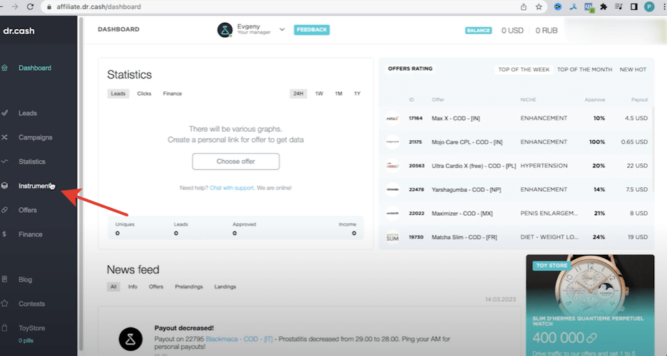
Select “Domain Parking tab”, select “Add Domain” at the right top, enter your name.
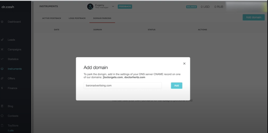
Then, go to DNS settings, select “Zone management” and add CNAME.
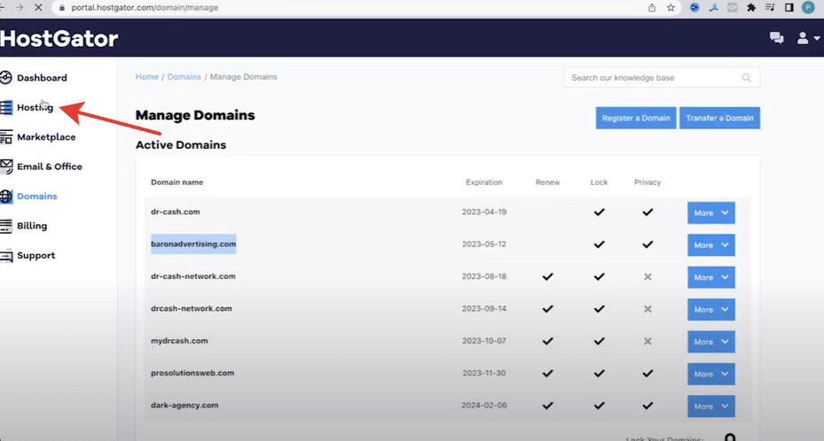
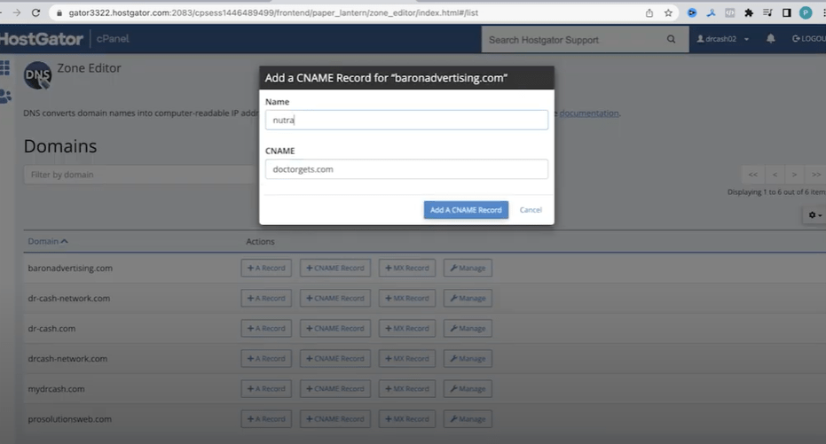
15 minutes later, check your domain. If you can select it when creating a campaign and a website works well, everything is fine.
By using domain parking, a webmaster keeps information about his advertising campaigns secret from other webmasters, and also saves the budget on buying or renting a server and hosting. He can also work with landers from the interface of the affiliate program itself. If you need to edit the lander, set up the transfer of leads via API, in this case you already need to purchase your own server or hosting.
How to design a pre-lander?
Pre-landing can be designed in various formats:
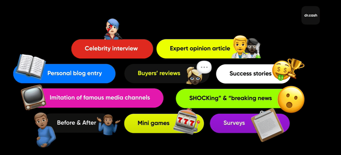
In addition to design, it is important that the content of the pre-lander itself has an impact on the user. To do this, first of all, you need to study your target audience, their attitude and understanding of the essence of the proposed product as a whole. Then we move on to the content itself. Most texts are written according to the HPAMR structure:
- H - Hero. Introduce the main character, tell their backstory.
- P - Problem. Describe the problem the character has, their pain point.
- A - Helper. Some situations are thanks to which a hero gets to know how to solve their problem. Heard accidentally or from a friend etc.
- M – Magic wand. The solution that miraculously solved the problem – helped to lose weight, get rich, get cured etc.
- R – Result. Description of the results. This part also includes recommendations and emotions of the main character.
Next, it is better to add comments and reviews from other users who also had a similar problem and solved it with the advertised product (better used with photos and a real image of the product pack).
To ensure good conversion, you have to add some more elements
- An intriguing headline. Something must make a client get interested in reading the article.
- Links to the product. They must look natural, don’t add too many links – two or three links and a call for action per one page will be enough.
- “Before & After” pictures. This trick is used actively in different marketing areas and remains effective nowadays.
- The pre-lander mustn’t look fake. A story, hero, problem, reviews, comments – everything must look natural so a user trusts it. Otherwise, you may lose even loyal (to a greater or lesser extent) clients.
Some more recommendations on how the website should look like
- If you use photos, use original ones. If a pre-lander looks cool, but a user has been coming across the pictures for months, your efforts will be in vain.
- If you imitate a news outlet, someone’s blog or any other resource, it shouldn’t be different from an original, it shouldn’t look like a cheap fake. At the same time, don’t add a bunch of blocks that can steal the users’ attention.
- If you use links in extra blocks, they should lead to other offers, not to the same lander. Otherwise, the user will understand everything and won’t trust your offer.
- Use charts and schemes, they help to gain customer trust.
- Use dynamic dates for comments and reviews to make a user think this is a real and popular website.
Once your pre-lander is ready, check the conversion rate. Launch an offer, changing a GEO, priority device, time to show an ad etc. Experiment with settings, as well as with the content itself, texts, pictures, fonts, visual design, tables. Remove and add elements to find better options – by the way, a/b testing via a tracker can help. You can watch other videos about trackers here.
Once a good pre-lander is ready, it’s time to add it to the funnel. There are several options depending on the client’s requirements, GEO and other things, but here’re the most common funnels:
- A creative, a pre -lander and a lander where orders are placed;
- A creative, a pre -lander, a lander and the advertiser’s website;
- A creative, a pre -lander, and the advertiser’s website;
- A creative, a pre -lander + a lander (in other words, a pre-lander with an order form).
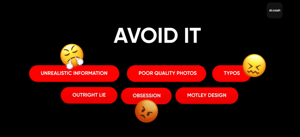
Here’s a list of things a pre-lander shouldn’t include:
- Use of unrealistic information, especially if it is easy to verify on the Internet.
- Hard selling.
- Low-quality pictures everyone is used to.
- Grammatical mistakes and other problems with text.
- Too bright colors are unpleasant to look at.
Now, let’s discuss the most common mistakes made when creating pre-lander.
- Mentioning product name often – it hits the eye and a user leaves the page.
- Unnatural reviews and comments – if you can’t create them on your own yet, you can find real ones in the same segment and adjust them for your pre-lander.
- Texts that don’t sell – now, you know about the structure of texts for pre-lander, but sometimes the structure is simplified, an author goes on like this: here’s a problem, and here's the solution, buy it.
- It’s not interesting for a client to read the text if there’s no personal story, no pain points. The reader won’t read the full text. That’s why it’s recommended to make sure a user has relevant experience. Influence the reader’s imagination, so that he or she imagines the situations and feels something you want them to feel.
Parsing a pre-lander for a “weight loss”
Theoretical part is over, it’s time for practice. Let’s have a look at a nutra pre-lander with good conversion and consider its benefits and drawbacks.
For analysis, let's take a pre-lander for weight loss products to Turkey.
- Language: Turkish.
- Laconic design, the number of blocks isn’t too big – nothing distracts a client.
- There are 3 main colors and one extra color to draw the user’s attention.
- The headline mentions the target audience’s problem and its sad consequences.
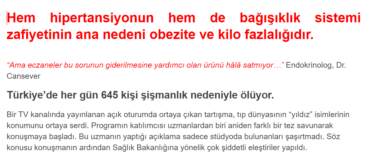
- Users see the statistics that makes them feel fearful and says that they aren’t the only ones with this problem.
- Text format - interview. Something a doctor says in the very beginning must intrigue a client.

- High-quality pictures of doctors, they don’t turn the users off.
- The text contains product descriptions and its benefits.
- “Before & after” pictures of patients – the proof of the product’s effectiveness.

- The text includes information about a raffle and says today is the last day, thus motivating a client to take part and make a purchase.
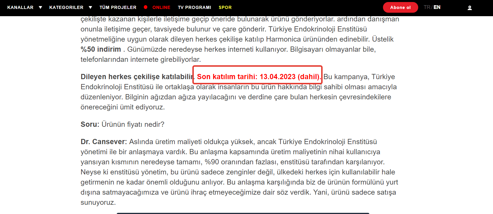
- The raffle itself looks like this – a client has to click on presents.
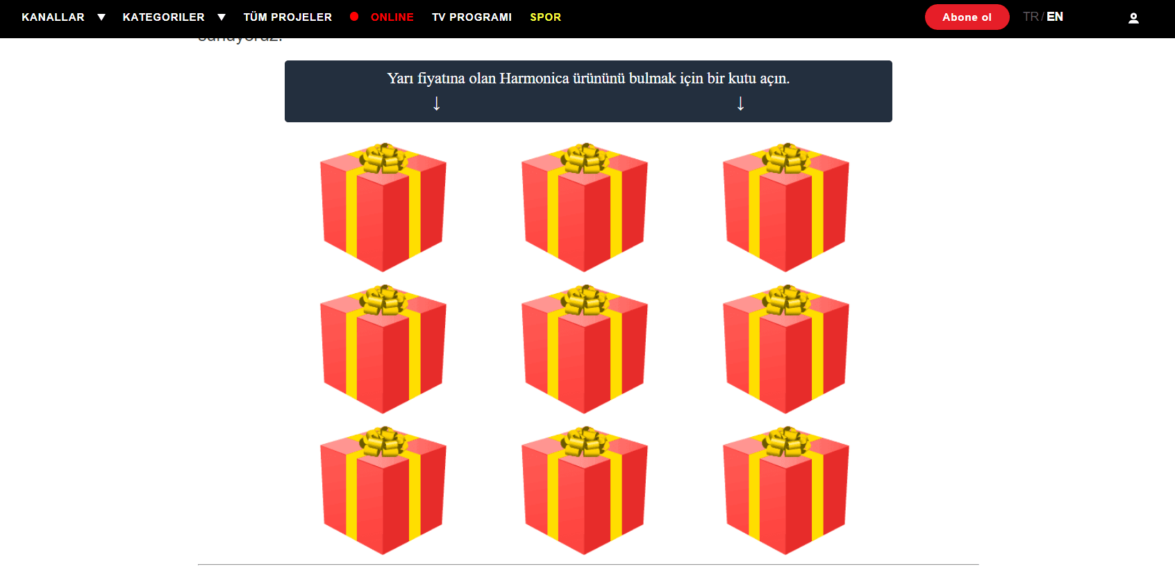
- It’s exciting: after the first click, a user has the last chance, and this time, he or she wins. In other words, a client must feel he or she won a discount on the last day of the raffle, not just come and buy something at a discount.
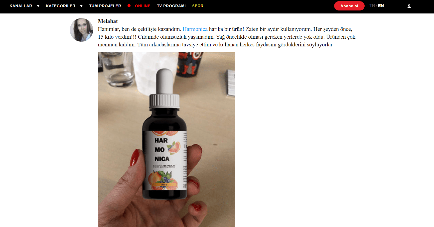
- After a user won a discount and before they buy a product online, they can see real photos of the product to learn about the quality of the package and to understand what the product’s size is.
- Below, you can see a lot of reviews with pictures.
Now, let’s talk about drawbacks
- This is a text about a solution, but there’re no research studies that would prove its effectiveness. The text needs the data. statistics and information about experiments and certificates.
- It’d be better to mention international media resources instead of local ones. The product that caught buzz all over the world is more intriguing.
- All pictures have different styles, it makes the page look cheaper. On the other hand, real photos look natural, and are suitable for this offer.
- The interview has no logical conclusion. They could work the text round to user reviews and answers to the most popular questions.
- This text is about health, it’s serious, a simple order form would be enough, a raffle isn’t needed.
- There’re pictures of people of different ethnic groups. At the stage of target audience analysis, take into account this aspect and use the pictures of people, taking into account the climate and population of the region.
In this article, we have studied in detail what a pre-lander is, why a webmaster needs it, and how to distinguish a good pre-lander from a bad one. We would like to note that only by regular tests and experiments with the content, targeting and visual component of the pre-lander can a webmaster achieve the optimal result for himself. So feel free to add new ideas to your pre-landers, be creative and grow your conversion with our useful materials from the "Affiliate Marketing Academy by dr.cash" project.
Want to start with nutra? Have questions about the case-study?
All the nutra is discussed now 24/7 in the telegram chat Nutra Affiliate Community
Quick help for beginners
Sweet cases for motivation
Exclusive bonuses from partners $$$$
Intelligent moderators and all support for affiliate network in one place


Sooooo gooooood💖💖