Nutra landing page (weight loss) analysis
We all know that every webmaster before run ads does an analysis, working through every point on which his future conversion depends: GEO, offer, target audience and its needs, creatives, triggers, language, etc. Also, based on his data, he should know exactly what points need to be avoided in an advertising campaign in order not to lose the invested budget.
In continuation of our recent post in TG about Turkey, we decided to make an analysis of one of the landing pages in the niche of "Diet-Weight loss". Step by step, go through the advantages and disadvantages of making creatives, find control points which the final profit of the webmaster depends on.
Offer: 19528 Harmonica - COD - [TR] from 6.00$
Landing: 25214
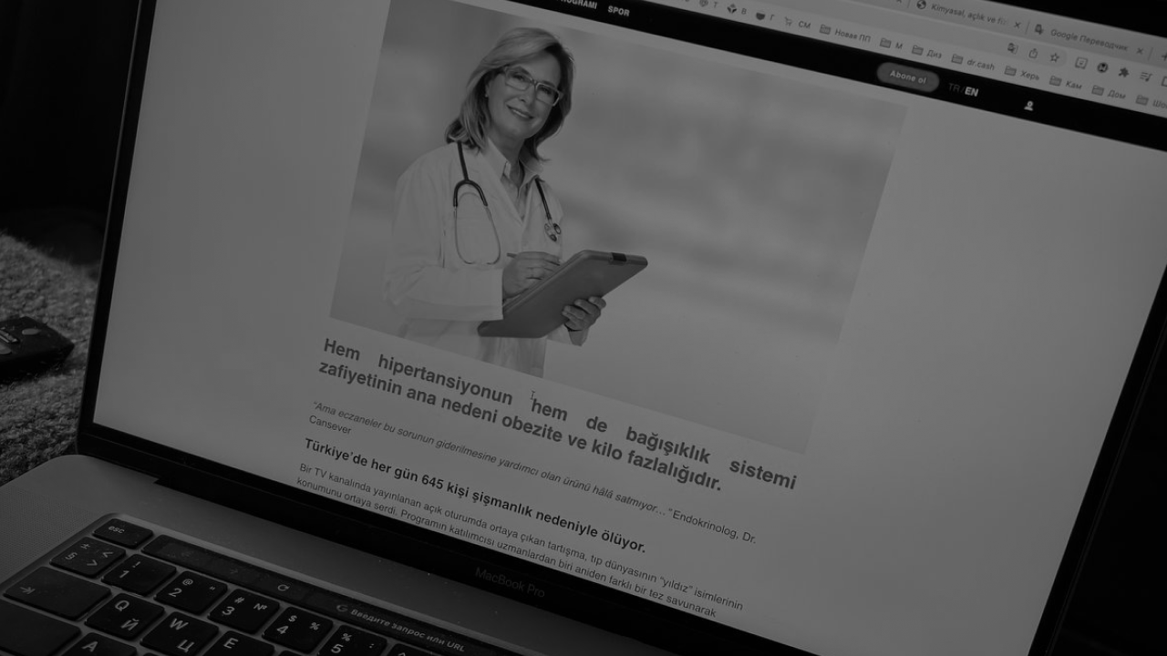
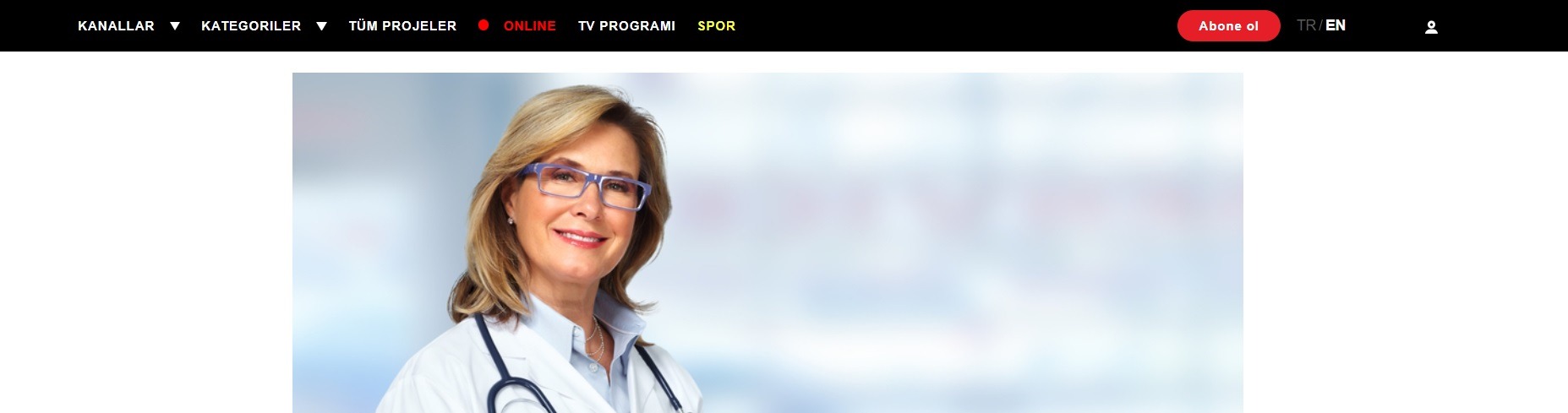
Click on the link and we get to the landing page of our offer. We see the menu, the ability to select the language and the action button.
Pros
Text.
- The landing page is compiled in Turkish, which is understandable for the user's perception of the necessary GEO = automatically increases confidence in the product.
- The title, which immediately increases the “pain“ of the target audience, also mentions several more health problems at once, which can catch the attention of a potential buyer:
Statistics on the disease are given, making it clear to the user that he is not alone and his problem is relevant for many people. To solve this disease, the necessary studies are being conducted.
- One of the most understandable formats is an interview. There is a doctor who begins his story with a quote. The buyer enters into a potential dialogue with a professional. The use of photos also visually attracts the buyer, because as you know, pictures always increase interest in the article.
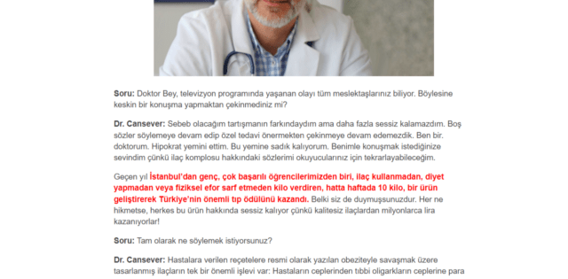
There are several specialists in this landing page, which perfectly emphasizes the degree of importance of the problem and the level of involvement of doctors in the way of its solution.
- The product presentation and comments on the landing page include working with objections (answers to questions that the buyer may have are provided).
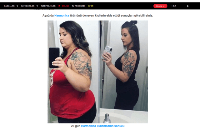
- A working product is presented, its benefits are indicated with examples and stories of people and their results.
- The offer to buy a product is limited by the time of the promotion and the quantity of the product. This motivates the user to make a purchase faster.
Content
- Clear and concise design, without unnecessary links, pictures and symbols, which increases the level of reader engagement, keeping his attention only on the product.
- To focus on the necessary points, the webmaster uses 3 primary colors and one additional.
- Photos of doctors of good quality. People smile at them, endearing the reader from the first seconds. There are medical accessories and equipment on the photos, which also increases the trust.
- There are photos of customers who have already tried the product and have a working result. There are a lot of “Before” and “After” photos that are related to the stories of people who have already bought the product. Please note that the buyers in the photo are smiling, they are happy with the purchase and its result, which may be an additional motivation for a potential buyer to make a purchase.
- When a user wants to make a purchase online, it is important for him to see a live photo of the product in order to view it, see the real size, packaging and its quality. Everyone is looking for real photos of buyers to make sure that the product is real.
Cons
Text
- There are no product research results. Data, statistics, extracts from scientific publications increase the conversion rate well. The buyer himself can go through the conditional process of creating a product when scientific data is presented, confirmed by laboratory assistants and doctors.
- There are not enough local mentions (local TV shows, celebrities, government agencies). A global analysis of the problem and the same universal found working solution that everyone is talking about. Would you also want to buy a product.
- The interview has no logical conclusion. You can lead the reader to customer reviews or to a product presentation.
Content
- All photos are of different styles in the article. Sometimes this is good, because “live” photos of people and their results do not need to be decorated, but they can reduce the visual quality of the landing page.
- There is a simple order form on the landing page, instead of a drawing. It would be more logical, based on the context of the article.
- There are too many residents of other countries in the article. It is always necessary to take into account the visual racial characteristics of the inhabitants of the region. Then the picture will look clearer and the user will understand that the product will work in his conditions.
Today we have sorted out the landing page in one sub-vertical, taking into account the criteria of the region and the needs of the target audience. Never be afraid to experiment, test, apply non-standard solutions, because you never know what can give a high response from your audience.
With love, your dr.cash!
Want to start with nutra? Have questions about the case-study?
All the nutra is discussed now 24/7 in the telegram chat Nutra Affiliate Community
Quick help for beginners
Sweet cases for motivation
Exclusive bonuses from partners $$$$
Intelligent moderators and all support for affiliate network in one place