Nutra creatives (hypertension) analysis
In continuation of our post about Chile, we decided to analyze several creatives in the “Hypertension” niche, talk about their pros and cons, and also consider a working landing page for these creatives.
GEO: Chile
Offer: 20622- CardioBalance - COD - [CL]- 17.5$
Landing:https://template.drcash.sh/f688ac49-867e-4ed0-b6c1-aa3f672c7e82
Creative analysis 1

¡Olvidese para siempre de los problemas de presión!
- Normaliza la tensión
- Alivia y limpia los vasos
- Totalmente seguro
- No tiene efectos adversos
Image
Proses:
- A potential buyer immediately pays attention to the bright text of the title, which not only speaks about the problem, but already gives a working solution and calls the user to action.
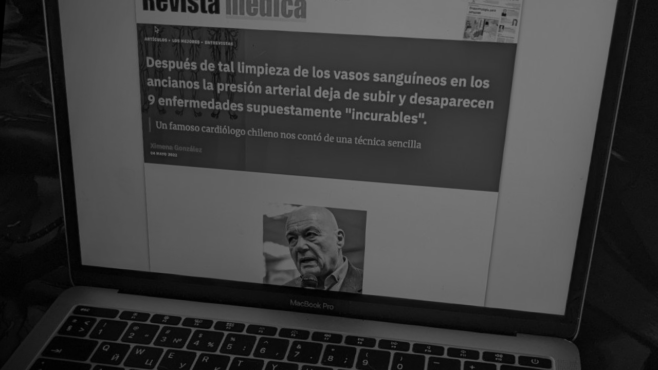
- In our analysis of Geo, we said that in Chile, medicine is quite expensive and sometimes people use traditional medicine or self-medication. The image of the doctor on the creative subconsciously triggers a person to trust, indicating that this product is recommended by doctors and it works.
- The creative shows a doctor who sits in a comfortable pose and smiles, letting the user know that he wants and is ready to help.
- Pictures that indicate heart problems subconsciously attract attention, being triggers.
Cons:
- The image is more standard for this niche and does not attract too much attention among others.
- There is a photo of the product in the image, and this does not always work good. The user understands that there will be advertising next. Consequently, the number of clicks may decrease and be limited only to those who really need to solve the problem with the disease that has arisen. This can also be a plus, since the target audience will already respond to the ad.
Heading
A neutral heading promising to help solve the problem and talking about the safety of the product. The advantages include the language used, which is official in the region and its colorful image.
Creative analysis 2
❌ Dolores de cabeza
❌ Fatiga crónica
❌ Apatía, irritación, somnolencia
✅ Normaliza la presión arterial dentro
✅ Restaura el tono y la elasticidad de los vasos sanguíneos
✅ Seguro para cualquier edad Efectivo en las etapas I, II y III de la hipertensión.
Image
Proses:
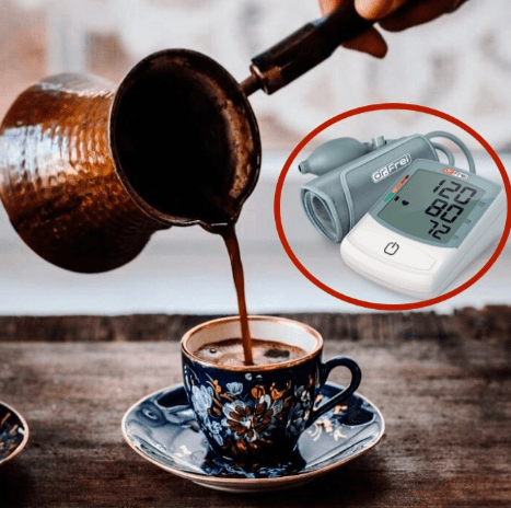
- The creative shows a blood pressure monitor. This is an item that is often used by people with this ailment. The tonometer is a trigger and causes an association with the problem. Thereby attracts the attention of a potential buyer.
- Also, a familiar object causing dissonance (coffee) is depicted on the creative. It is also a trigger, since a large number of people who suffer from the disease and like to drink coffee and subconsciously would like to find a solution.
Cons:
- There is no title on the image that will interest the user.
- If the user does not see an interesting title in the ad, he will not be able to understand the usefulness of this ad for himself and may just pass by.
Text
Proses:
- The text is highlighted with bright elements that attract attention.
- Each item is highlighted and spelled out separately, the information for the reader is structured and understandable.
- The text identifies and visually highlights not only problems, but also solutions. The reader subconsciously goes from bad to good, applying it to his problem.
Cons:
—
Creative analysis 3

🔔Después de los 40 años, su salud está en riesgo si no limpia los vasos sanguíneos.
Ayuda a tu corazón hoy
Image
Proses:
- All the same tonometer, which causes associations with the problem.
- There is something unclear that attracts attention and interest, what kind of product and what kind of action it has.
- The creative depicts homemade twists, greenery, a checkered tablecloth. Everything leads the user to think about traditional medicine and care from loved ones. The user thinks that during the transition, a person will receive a recipe for a home remedy.
Cons:
- There is no bright additional header in the picture, which reduces the conversion rate.
- The user may not understand the combination of objects in the image the first time (if he does not read the text), which may discourage him from going further.
Text
Proses:
- There is an accent on the problem.
- Expands the target audience. Makes those who do not have such a problem think.
- The text goes well with the image.
Cons:
—
Landing page
All three creatives can work well with this landing page:
https://template.drcash.sh/f688ac49-867e-4ed0-b6c1-aa3f672c7e82
Landing from the very beginning expands the target audience by increasing the unpleasant symptoms of the disease. Also here is a possible way to get rid of the main problem and related symptoms with the help of a working product.
Landing does not start with advertising and calls to buy a product. This makes you read to the end and find out the opinion of a professional in the person of a doctor who is being interviewed. The advantage of this landing page is also the research of the disease, which is accompanied by images, which increases the trust to the product and to the expertise of the doctor.
Today we have sorted out creatives and the working landing page in one sub-vertical, taking into account the criteria of the region and the needs of the target audience. Never be afraid to experiment, test, apply non-standard solutions, because you never know what can give a high response from your audience.
Taking care of your profit, dr.cash!
Want to start with nutra? Have questions about the case-study?
All the nutra is discussed now 24/7 in the telegram chat Nutra Affiliate Community
Quick help for beginners
Sweet cases for motivation
Exclusive bonuses from partners $$$$
Intelligent moderators and all support for affiliate network in one place